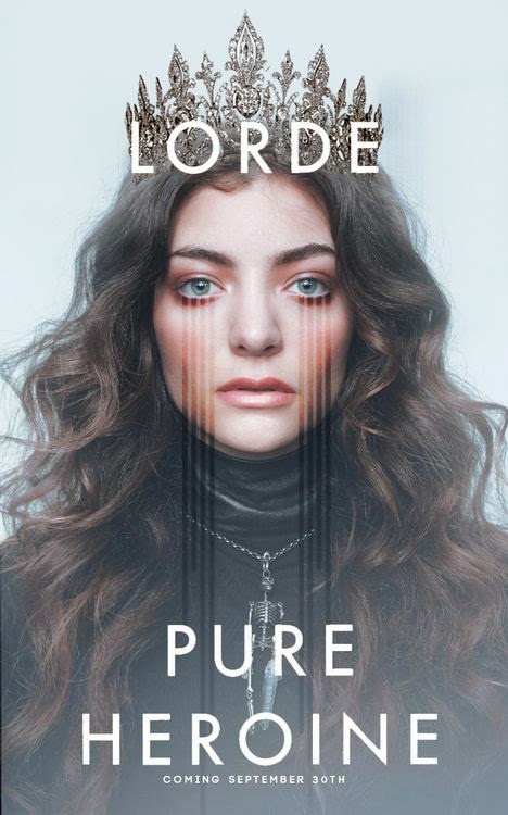
Lorde is a female solo artist who is part of an
Alternative Rock genre. The poster is used as an advertisement for both the
artist and her album. The only image is a photo of Lorde, and the main focus of
this image is her face, in which the colour of her eyes and her make-up are
most noticeable. They have also drawn four lines from her eyes, which create an
edgier vibe and create the impression of tears, which could represent the emotion
behind her lyrics. In the photo she is wearing a black turtleneck top, which
could be a symbol of rebellion against the stereotypes of twenty-first century
teenage girls, also it could be a symbol of her royal name as typically royals
dress modestly. The skeleton necklace she wears is a contrast to her crown,
which is a symbol of power whereas a skeleton is an image of death. She could
have decided to do this as a representation of what her songs are about.
Additionally the crown is a link to her name. The background is a contrast to
the image as it is pale blue and creates an angelic feel whereas the main
colour in the image is black, which is a representation of evil. The font used
is white which is a symbol of purity and is a contrast to the colours used in
the image and the simplicity of the font ensures that the image is the main
focus of the poster.

No comments:
Post a Comment