Monday, 15 September 2014

Maroon 5 CD Analysis


The typical codes and conventions that I can see on the front cover of Maroon 5s album is the group name and album name in bold and clear writing. There is also a main image on the album however the image is atypical, as generally artists like to have his or her own image on the front album to make it clear who the artist is. Maroon 5’s album cover ‘Hands all over’ focuses on a naked woman on a white duvet; the white sheets could imply innocents but this contrasts to the image of the woman which could highlight her vulnerability. The four hands on the woman’s body also links to the name of the album, which forms a clear association for the audience, when they see the image they will be able to make the connection to Maroon 5 and their album. The fact that the album cover is quite explicit makes it clear that the group and the album is aimed at an older audience however the cover still contains some modesty suggesting that it would still appeal to older teenagers. This is also emphasised through the red font, red commonly represents danger, and in the context of the album cover this could represent the impurity of the woman and or the message of the album and songs. The red ‘V’ symbol and two linking o’s also shows a clear connection between the poster and the band and again gives the group a unique image, which is easily associated to the band.

The typical codes and conventions on the back cover of the album is the barcode, a continuing and or linking image similar to the front of the album, song list and the copy right and distribution information. The back of the album cover has subtle links referring back to the front cover of the album shown through the image of the bed in the bottom left corner. This shows a clear link to the front and back of the album without overpowering the image of the group. The photo of Maroon 5 in the top left of the back cover is the first image we see of the band on the digipak. The photo used is the same image used on the poster again creating a clear link between the groups, the poster and the album. The simple font used again doesn’t overpower the back cover and makes the photo of Maroon 5 stand out more so the audience can tell what artist the album belongs to straight away.

The typical codes and conventions on the CD is again the artist name and album name, and copyright and distribution information. One atypical convention of the CD is that the image isn’t a continuing or linking image so it doesn’t tie in with the album cover and album back making the group seem more unique and interesting. The CD in the album is very different from the front and back of the album. This gives the album a new element, which will intrigue the audience. The image of the lake looks quite dark and gloomy which contracts to the upbeat nature of the group and their music, however the lighting on the water looks quite calming again creating a contrast. This again makes the group seem more intriguing to the audience making them want to invest more into the group. Finally and similarly to the album cover and album back the red ‘V’ and linking o’s gives the group a unique image making it easy for an audience to identify them.


Lord CD Analysis

The codes and conventions used on the front cover are the artist name and the album name. Lorde’s album cover ‘Pure Heroine’ is very simplistic, the cover does not contain any images and merely has the artist and album name on the front. Lorde may have done this, as she did not want to reveal too much about the songs or because she felt the songs could speak for themselves. The background is charcoal coloured and the font used is white, this could show Lorde’s purity within a tainted society. This is also highlighted by the contrast in colours, where the majority of the colours used are dark with just a small quantity of light colours. The album title ‘Pure Heroine’ is literally a righteous female leader, and her name Lorde is a feminisation of the noble noun, both make a bold statement and may highlight how Lorde views herself among society. Lorde uses the same font on her advert as she does on the album for consistency and professionalism. Also if she uses the same font on all products associated with her people will know who she is without having to have a photo of her.

On the back cover the codes and conventions are the song list, the distribution information and a barcode. The back cover of the album maintains the simplicity of the front however it contains the single names, a small digital image of what seems to be Lorde, she may have done this to give the audience a small insight into her appearance without revealing to much. She may have decided to put it on the back, as she did not want her appearance to be the main focus of the album. Additionally there is a barcode and the distribution information, which is to comply with codes and conventions of albums and allows the audience to know more about the background of the album and the artist. 

The disc is white which again represents purity among the dark, which represents a broken down society. The only content on the disc is a black ‘L’, which is the same font as all other information, which has been done to have consistency among the product, additionally to maintain consistency there is the same digital image that is on the back cover. The booklet inside the album is again black with white writing and the pages contain the song lyrics and images of the artist. This is appealing to fans if they want to sing along to the songs or if any words are difficult to understand they can check to find out what the artist is saying.


Coldplay CD Analysis


The stereotypical code and conventions of this CD are the main image, name of artist on the cover and down the side of the casing and the names of songs on the back.   


Coldplay’s album cover ‘Ghost stories’ contains a single image in the center of a blue night sky and ocean background. The lighting has been placed central around the image and it slowly dims out to the background in a circular spot light shape. The image is consistent as it is also used on their poster advertising their tour. By linking these two forms of media they have made it easily identifiable to the audience. The wings are centered and contain multiple images that are supposed to link to medieval times and the stories that were told. Some of the smaller images include a ladder and a circular maze; the small detail added to the main image makes it more intriguing to the audience and draws them in when the album cover is placed on a shelf. The fine detail of the wings is still very prominent on the image despite the fact they contain multiple small images, this emphasizes the album ‘Ghost Stories’ as the pale white wings link to death and the after life. The background is an ocean scene with a starry night sky.

For the back of the CD cover the background has continued and they have listed the song titles down the centre. The font is gold which helps it stand out from the dark blue background. As well as the colour of the font they have also wrote it in capitols by using a light colour against a dark background and putting it all in capitols they have made it more eye catching and easier to read. The font is also very simplistic which could represent the simple look of the band however their music is very up beat and ‘exciting’ and this is represented by the royal look of the gold colour font. The barcode has been placed in the right corner where it stereotypically is and the copyright and distribution information had been placed in small white text to the left.  They have also added the logo of Warner Music so buyers will be aware of which conglomerate they are signed to. It also has the logo of the subdivision of the record label Parlophone. By adding all this information the consumer will always be away of whom they are buying from.

Once again Coldplay have kept it simple by having the same font, background and copyright information on the disc. However they have not placed the image of the angel wings on the disc. They have also place a booklet inside with the lyrics to each song and images of the group.  This makes the album more appealing to the fans as they will feel they know the artists and their songs. They have also used similar images and drawing styles that are placed in the wings on the main image onto the first pages of the booklet, keeping it consistent and yet intriguing due to the intricate images.  

Tuesday, 9 September 2014

Maroon 5 poster analysis


Maroon 5 fall into the genre of pop rock and were formed in 1994 as Kara’s Flowers, originating in America. This poster is advertising their new album tour ‘Hands all over’. The main focus of the poster is the five members of the group, the dark black background used emphasises each members face while the pale white lines used around the group also gives the impression of a spotlight around the artist emphasising their fame as well as drawing the audience’s eye to the centre of the poster. By positioning the group in the centre of the poster the audience can see straight away who the poster is advertising, this has been done intentionally to again emphasise the group’s fame and to draw the audience into the centre of the image so that they are the main focus of the advertisement. The red V used throughout the poster represents the roman numeral for 5 which links to the name of the group, it also gives the group a unique attribute which makes them stand out from similar and competing groups in the media. The main font used is quite simple; the white font against the black background makes it stand out and the red V gives the font a distinctive look that is individual to the group. This said the two o’s linking together could represent the strong relationship that the group have with one another and it again give the group and clear and recognisable trait. The small advertisement of their new album at the bottom of the poster links to the tour and promotes their new album allowing them to publicise their tour and their album at the same time thus appealing to a larger audience.

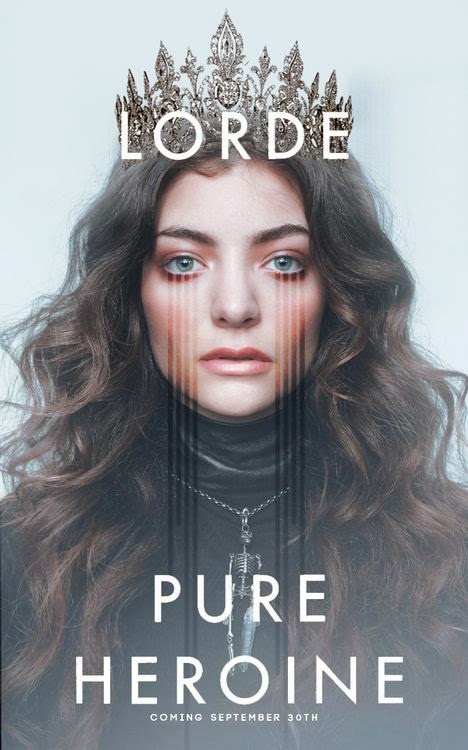
Lorde poster analysis


Lorde is a female solo artist who is part of an Alternative Rock genre. The poster is used as an advertisement for both the artist and her album. The only image is a photo of Lorde, and the main focus of this image is her face, in which the colour of her eyes and her make-up are most noticeable. They have also drawn four lines from her eyes, which create an edgier vibe and create the impression of tears, which could represent the emotion behind her lyrics. In the photo she is wearing a black turtleneck top, which could be a symbol of rebellion against the stereotypes of twenty-first century teenage girls, also it could be a symbol of her royal name as typically royals dress modestly. The skeleton necklace she wears is a contrast to her crown, which is a symbol of power whereas a skeleton is an image of death. She could have decided to do this as a representation of what her songs are about. Additionally the crown is a link to her name. The background is a contrast to the image as it is pale blue and creates an angelic feel whereas the main colour in the image is black, which is a representation of evil. The font used is white which is a symbol of purity and is a contrast to the colours used in the image and the simplicity of the font ensures that the image is the main focus of the poster.